FLAGS OF FREEDOM, 2020
Jérôme Sans
FLAGS OF FREEDOM
Mette Winckelmann interviewed by Jérôme Sans (2020)
Jérôme Sans: How would you describe your work?
Mette Winckelmann: I would describe it as flexible and open. In my practice, I am try- ing to stretch formats and categories all the time. My starting point is almost always to go deep into a specific material or medium in order to probe its properties and possi- bilities. I am trying to push beyond the ex- pectations and limitations tied to a specific material and its traditional use, to allow it to perform new meanings.
JS Categories are crossing geome- try which is an obsessive element of your work. Can you explain why?
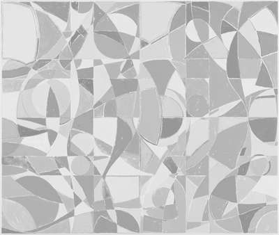
MW I find it intriguing to explore ge- ometry and mathematics as systems that also reflect the structure of society. I like to take elements from those systems and push them into something more open, or- ganic and human. It is something that can somehow also contain doubt, the ques- tioning and undoing of the system. In 2013, I made the outdoor sculptural work Belief and Superstition for Viborg Kunsthal. The work consists of concrete tiles in five grey- scale tones forming a mosaic, similar to those you find in quilted rugs and patch- work, where the whole is made up of lots of smaller, symmetric squares of fabric called “blocks.” I followed the measurements and rules of the traditional patchwork process – which is based on symmetry and mathe- matics – but took the liberty of skipping the systematic repetition.
JS When you use patchwork, it has a specific meaning ...
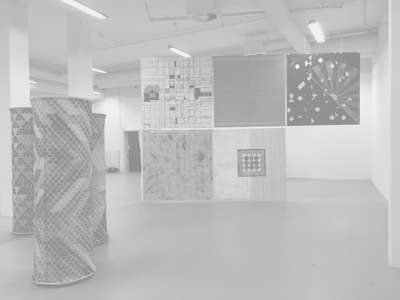
MW Yes, traditionally, when women got together to do patchwork, they formed a community of exchange, both the technical know-how and more specifically the mate- rial itself. They exchanged pieces of fabric to make all kinds of varied patterns. Pro- ducing a quilt or patchwork is in essence a collective process, the gathering of smaller units that form a unity. The intersections between the blocks, where they meet and produce an asymmetry, is for me where the project opens up possibilities for new agen- das, for change. The block spaces are also the starting point for my solo exhibition at the Maison du Danemark. In the space, I am
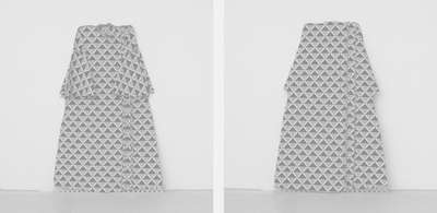
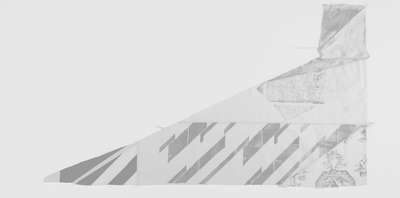
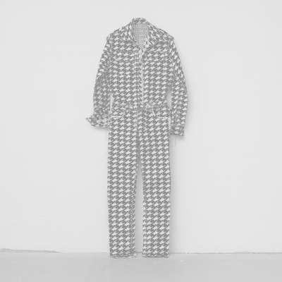
trying to create passages from one work, one material, to the next in order to make them feel connected. I am producing a se- ries of flags, which will hover and demar- cate the space, but hopefully also create a distinct rhythm and thus a new perspective on the existing works I am exhibiting on the ground. The flags are all based on a grid, which contains a pattern that incorporates visual elements from the other works. So, the flags are manifestations of inclusion and negotiation through repetition.
JS Several of your works consist of flags. What does the flag represent to you: an object, a symbol?
MW Often flags are made up of clearly defined, minimalist shapes of colour, which make them easy to identify from a distance and therefore also effective as symbols of identity, giving rise to feelings of both unity and division. By raising a flag, a group of people can declare: “We are all connect- ed because of this flag,” and in doing so automatically exclude anything or anyone considered as being “other.” A flag is a sign, a clear visual statement and therefore an impactful tool of communication. I like that. At the same time the rules, ideas and traditions tied to flags are begging to be challenged and somehow disturbed in the artistic process. For the show at the Maison du Danemark, I am making flags of freedom, which are all in a state of transition, repeat- ing patterns yet in the process of becoming something new.
JS Your paintings are based on sys- tematic combinations, shapes and colours that imitate or use visual techniques and structures drawn from the craft traditions of various cultures. How did you come up with this idea of the grid as a composition- al system? The grid is often a metaphor of society’s structure and rules, but you use the grid to push, challenge or even reverse it ...
MW Yes. First and foremost, I use the grid as a starting point to navigate the world. It helps me determine scale and my own position in relation to the objects and subjects I am exploring. When I start a work, it is very important for me to know where it starts and where it stops. In other words, where are its limits. I always begin a work by dividing the surface area into halves, thirds and quarters. I proceed in the same way when I make commissioned murals for specific buildings, a cover for a book, a painting or drawing, or works for an exhibition space. I immediately take my ruler and divide the space; only then do I feel comfortable and can start thinking in and with the space. I adhere to these self- made rules, because for me systems are also about belonging, the longing to fit in, feel safe within a given structure, to feel your place in the bigger scheme of things. It is existential, really. At the same time, I want to acknowledge that rules, structures and norms often exclude diversity and dis- courage deviations and transformation. This is why it is important for me to trigger the grid and push its limits.
JS Is the grid you often use a regular system or could it be disrupted by chance, irregularity or error?
MW I always try to design an exact grid, a plan for precision. At the same time, I am expecting the system I set up to fail or devi- ate from the plan. I think of these hiccups as corrections, which are inevitable by-prod- ucts of a stringent plan or work process. I embrace the loss of set frames, control, a privilege, a position that follows when you cannot live up to expectations of a given system. There is always a learning potential in that kind of loss, as in Showpiece (2018) which consists of eight fabric reliefs. Each piece mirrors a ready-made, a clothing item I’ve acquired, which I have attempted to faithfully reproduce. However, the process of sewing each item in calico, a very solid and inflexible material, on the machine, is slow and, of course, variations are inevitable when the human hand is the agent.
JS In your work, geometry and mathe- matical systems are related to the human body and its measurements. Why?
MW Geometry is embedded in the human body. Symmetry, measurements, balance, size, scale. Geometry and math- ematics relate to the need to map, define and understand the individual vis-à-vis the collective, and the distances between them. Geometry is a way to define society or what is outside our body. At the same time, geometry alludes to the inner body. All concrete measurements, like the number of fingers, toes or teeth, contain irregularities that confirm we are dealing with organic, living matter undergoing change.
I have also worked a lot with diagrams be- cause it is a tool to take a wider view, to situ- ate our existence in relation to the universe. In a recent large-scale outdoor commission for a residential area, I built various visual yet functional circular elements, such as a seating area and a soccer field, for resi- dents to use. Each of the elements are in- spired by ancient and new circle diagrams,
or pie charts as they are also called, which somehow reference the order of the uni- verse. I removed all numbers and letters and reduced the original diagrams down to abstract visuals, which I then gave dif- ferent material expressions using silicates, elements from the earth – tiles of clay or rocks (some found on site) – allowing the senses to experience the diagrams in new ways. The twenty-one circular sculptural elements form a visible connection, which you experience as you move around and through the site.
JS You’ve said that you are inter- ested in the “grey” areas, the spaces “in-between”. You also work on interstitial spaces, where negotiations can occur. Why are in-between things and interstitial spac- es so important to you?
MW The grey areas are for me what exists between binaries and poles. Here all sorts of variations can arise. In terms of colour, for example, it feels easier to go from one colour on the greyscale to another than it does to go from black to white. The in-between space creates an opening for something that is shifting and evolving.
JS What role does colour play in your work, especially red, white and black? Red is often used as a forbidding sign. It recalls the history of revolutions, for example. Is it a way to deal with the other side of society and of the world itself?
MW Colour is a topic I could go on and on about! In the series Come Undone (2016), for example, my starting point was red, black and white as pure colours. The first painting is black only. In the next I’ve added white. Then in the next, red. As I con- tinued the series, I began mixing the three colours. Step by step, we go from colours that are clear contrast to colours that re- late differently now that they are no longer binaries or contrasts.
I have researched a fair bit of the history of colours over the years to try to understand how the individual and collective perception of colour has changed historically. Colours are signs, which we “read” with our senses in a very different way than we decipher words we hear spoken or read. But colours and words are actually closely connected. Ancient texts from all over the world, from Icelandic sagas to ancient Chinese scripts, and including the Bible and Homer’s writ- ings, to name a few, reveal (according to scholars) that the first colours named and recognised as such are white and black (Lazarus Geiger). The next colours to be defined were red, then yellow, then green,
and much later blue. I always loved the cu- rious fact that in Homer’s works there is no blue; the ocean is described as a red-dark sea, the sky is described in all other colours but blue. The fact that black, white and red are the first colours that we were collec- tively aware of seems interesting to me. In that sense using black, white and red to sig- nal a revolution or protest returns us to the birth of a collective conception of colours, as well as all the perspectives it excludes. In my work, I try to always be conscious of the fact that working with colours is work- ing with references, associations, feelings, senses. You are activating a certain atmo- sphere or ambiance, similar to the way a chord can fill a room and activates an emotional register in a listener. This is also what made me more interested in the “co- lours in-between.” Unlike specific primary colours that are often assertive and declar- ative, in-between colours are less locked and can therefore activate our senses in new and unexpected ways. There is more room for negotiation.
JS You often use the word “negotia- tion” particularly, as you mentioned to me, because as a woman you must negotiate constantly. Is it a reference to your position as a woman and an artist?
MW Yes, definitely. After working and dealing with colours for many years, I be- came aware of the complexity of the vari- ous agendas and motivations tied to colour and how colour connotations have shifted historically. When I visited the Lesbian Her- story Archives in New York, I noticed a pin on which was written, “I like older women.” The text was above a black triangle on a red circle, which could be read as an icon or sign for the female genitalia. Geometry and colours were conveying a very clear activist statement. The same signs – circle, triangle and colours – have before and since been used for completely different purposes, but with the intention to bring about change. I am triggered by colours and intrigued by the fact that a colour speaks on another level than language. You sense that the co- lours are associated with signs. The signs come from history and from a kind of col- lective memory. Yet everyone has her own perception and memory of colours, which impacts their experience of the colours used, for example, in my work.
JS This specific pin became the inspi- ration for a work titled I like older women (2014).
MW Yes, the badge uses a very simple geometry to make a sign referencing the
female genitalia and gender. I reinterpreted the colours and proportions of the badge and translated them into another medium: a painting and a hanging mobile.
JS When I met you for the first time in Copenhagen, I remember you were wear- ing another pin... MW Yes, I was wearing another 1980s badge from the Lesbian Herstory Archives. The design is very simple. It is a black pin with a pink triangle on it. The pink trian- gle has been a symbol for various LGBTQ identities, initially intended as a “badge of shame,” but later reclaimed as a positive symbol of self-identity. In 1930s and ’40s Germany, it was concentration camp badge, distinguishing those who had been identi- fied by authorities as homosexual men. This category included bisexual men and trans- gender women. In the 1970s, it was revived as a symbol of protest against homophobia, and has since been adopted as a popular symbol of the LGBTQ rights movement. For me it is an important example of how a geo- metric sign and colour used in a political cause can undergo a transformation over time and come to signal something else entirely.
JS There is an underlying strand of feminist politics in your work. Is this per- haps a way to contribute to the writing of a counter-history to abstraction, which has so often devalued or excluded women art- ists and their work?
MW The more inclusive and political no- tion of abstraction is certainly important to me. Geometry and colours aren’t just free to be formal. Colours and shapes cannot be sublime or perfect in a neutral way. They are not fixed in terms of their meaning. For me this flexibility is positive. At any historical moment, abstraction depends on the gaze, who is looking and what associations they bring to it. Every form, every colour has a lot of connotations and references. It’s one of my interests and something I’ve explored a lot so far: what role is colour performing in a space, public or private? What kind of impact is it having on an individual as you enter that space?
In 2019, for example, I built the installation LAILA UTI in an old mansion, which used to be a mental institution, but is now the Augustiana Kunstpark and Kunsthal. Con- sidering the space as a site of mental trans- formation, I tried to make an installation that was visible under construction, unfinished, without a beginning or end. In addition to a lot of ready-made scarves and cloth pieces, I used metallic and silver colours to try to
emphasise the idea that people were enter- ing a “machine room,” a space in formation. I thought of it as a kind of urban backstage area which didn’t lead visitors to a finished front stage.
JS In much of your work, you use every-day or found materials such as fab- rics, rocks and ceramics. Sometimes you reappropriate industrial or material tech- niques that have been traditionally coded “women’s crafts.”
MW Yes, that’s true. I have always been interested in the idea of using traditional techniques or crafts to expand the scope of my possibilities. Often a work or a project starts with me doing a kind of set-up, partly with a material, and partly with a technique, which requires a specific skill. This is why I often work with a technically skilled as- sistant. In a joint dialogue, a process starts with the material, where I try to remain open to where it might take us. The work is actually both the process itself and the visual outcome of decisions and actions embedded in the process. The project BUTIK (2020), where I produced and sold clothing in a shop, is an example.
JS In your entire body of work – from your silkscreens to your sewing pieces – the pressure of the movement, of the body, of the hand remains. You seem to always want to keep the traces of the artistic pro- cess.
MW Yes, in BUTIK, for example, I was dealing with fabric in relation to the body, both as a wearable and as a material in the artistic process. I used the storeroom itself as a material, as a “canvas” and founda- tion for the process that took place on site. In collaboration with a tailor, I drew a cut pattern for a garment, a one-size unisex short tunic, which I put into production in the exhibition. BUTIK was a living installa- tion. During opening hours, two performers worked on sewing pieces of linen for gar- ments and then manually printed them with the textile colours black and white, as well as mixed shades of grey, in a square frame. The finished tunics were sold in the store at a price corresponding to the cost of pro- duction for each garment, of material and labour. Through this process a by-product arose: the residual colour in the frame from the printing process, which was cleaned up by swiping it across a bare linen canvas. It constituted a negative print of the pres- sure created on the garment. Suddenly I had the same number of prints as pro- duced tunics. I subsequently mounted and exhibited these prints in a gallery show
titled GALLERY. Hung sequentially, these works inscribed themselves in a history of conceptual photography, minimalist and abstract painting, somehow then pointing back to the question of the value of textile works, a category of production and cre- ation linked to a particular gendered history.
JS Your paintings have no definitive order to be shown. They are hybrids and open. They have no beginning and no end. They can continue in time and space.
MW My works are flexible. But when I work with a material and it finds its own limitations, it also reaches other potential- ities. Actually, they are all kinds of differ- ent potentials in materials that could be revealed even after the artistic process or, for example, when a work is shown in an- other situation or in another context. When there is a new context, new potentials arise.
JS Your work is never frontal, but it has several layers of meanings. First, you can see colours and shapes superimposed and, hiding behind them, some rules and stories that are not written down explicitly. So, I wonder, what is your relationship to conceptual art?
MW I’ve always been very interested in conceptual art. Of course, when working in the field of art, there is always something that goes away from the material aspect to the conceptual level. It is important for me to feel that in the end the work is coherent because it is driven by its own concept.
JS Sometimes you also make state- ment pieces like your piece called WE HAVE A BODY (2011). Why? MW What is crucial with such a state- ment is to express the fact that although we are conscious of our own body, we are all connected with the other bodies around us. We are always aware of our own body through other bodies that are looking at us. It is a reality that our identity is always influ- enced by the way other bodies act on us.
JS How do you feel about the inter- action between art, politics and activism? Even if it is not obvious at a first glance, your work is activist.
MW Yes, activism is a basis for my work. I like to discuss important issues but I am not sure that I share the same language as people since I am more visual than verbal. You could call it visual activism.
JS How do you see the future?
MW Better than yesterday. I am very positive. I believe in good changes to come.